Most commonly used charts in BI

Introduction
For a decade, the amount of data used by companies has increased frantically, therefore the importance to extract the right insight and actionable information from data has become crucial (charts in BI). Graphs and charts are a better way to show data and spot trends than just looking at it raw from an Excel file or SQL database.
In consequence, data visualization becomes more and more important in nowadays industries. This competence is of great importance to give the right message to the audience clearly and effectively. Indeed, charts and graphs help for that purpose, but selecting the wrong chart can cause misinterpretation and bias. In contrast, using the right chart makes communication more efficient and without ambiguity.
Data visualization helps you to analyze and visualize your data, but before using it, keep in mind the use you will make of it: is it to convince? To clarify a point? To show results and progression? This article will guide you in collecting consistent data in your scope.
This article covers some of the most commonly used charts in data visualization and all the illustrations below are made using Tableau and the included and free database “superstore sample database”.
Charts & graphs
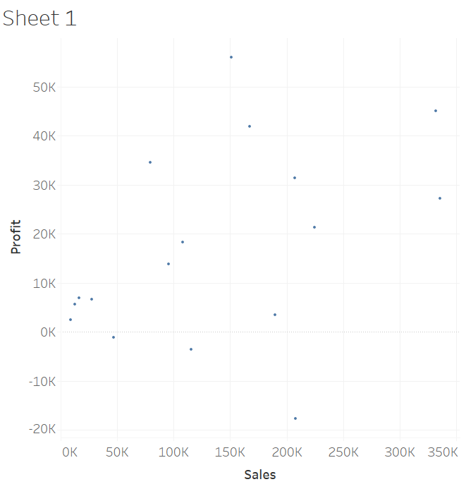
Scatterplot
The scatterplot is effective when you want to show the relationship between two numeric variables. The degree of relationship, either positive or negative, is extremely easy to spot on those graphs. Use it when you want to highlight similarities between two large data sets and how much one variable affects another. Additionally, this chart is useful when looking for outliers at first glance, as extreme values are often located far from the other dots.
Line plot or line chart
A line chart provides a good way of displaying data over a period. This graph allows visualizing time series data and changes over time. It is one of the most popular types of graph. Use it when you want to display trends and when you have to chart a continuous variable. You can plot more than one line to show many different categories of data at the same time and compare changes for more than one group over the same period. For example, a business can use the line chart to compare monthly profits for different types of products over the past few years.

Bar graph
A bar graph helps you compare data between different groups or to track changes over time. Bar charts are most useful when there are big changes or to compare categories in data. A useful way to perform data analysis on continuous variables is to pack a range of values into a class and to observe if the distribution changes a lot between the classes. A bar is of great interest in this case.

Area chart
If you need to show a relationship between two time-series variables, an area chart is the best option. It combines the pie chart with a line chart by giving a visual on the change in one or more quantities over time much like the line graph. In this chart, a line to show the value of the quantity at different points in time also connects data points. It is also good for showing trends. However, an Area chart is different from a line chart. The area between the line and the X-axis is colored. Thus, an Area chart gives a sense of volume.

Bubble chart
A bubble chart can present 3-dimensional information in two dimensions. It is very similar to a scatterplot with the size of the bubble being information in itself. Bubble charts are used when you want to depict a relationship between three different variables.

Pie Chart
This chart is of great interest when you have to show categories distribution among a whole entity, thus its composition, or if you want to compare the effect of one factor on different categories. For a better understanding, the numbers are percentages and each slice has a different color. It is recommended to order the slices by size and not put too many categories (up to six categories), to make the insight clear. For this purpose, do not hesitate to regroup a few categories into bigger ones.

Waffle chart or Square Pie chart
It is a 10-by-10 cell grid, where each small square represents 1% of the whole chart. It is used to see an item’s contribution to a whole and to show different KPI percentage values. The squares are colored considering the proportions you are aiming to visualize (like a pie chart).

Treemap
By using nested triangles, it displays a hierarchical structure and it is organized as branches and sub-branches. It displays rectangle areas according to quantities for each category and sub-category. Treemap is a compact way to show hierarchies and highlight distributions and compare quantities of different categories.

Heat map
On this map, a main variable of interest in analyzed across two axis variables in a cell grid. The color of each cell translates the value of the main variable, and each cell represents the intersection of one category of each axis variable. The larger the value, the darker the color. The heat map is very useful when you have to collect customer sentiment, by showing the number of users/votes on a two variables axis that can be the different website designs and the different products. Alternatively, in a more data context, the correlation between two variables, by showing the correlation value between two categorical variables.

- https://blog.hubspot.com/marketing/types-of-graphs-for-data-visualization
- https://medium.com/analytics-vidhya/top-10-most-useful-charts-in-data-visualization-a4c9365d03e4
- https://www.intellspot.com/data-visualization-types/
- https://chartexpo.com/blog/types-of-charts-and-graphs#
- https://towardsdatascience.com/data-visualization-101-how-to-choose-a-chart-type-9b8830e558d6
- https://koenvandeneeckhout.medium.com/uncommon-chart-types-waffle-chart-51387eb52f5e
- https://chartio.com/learn/charts/heatmap-complete-guide/